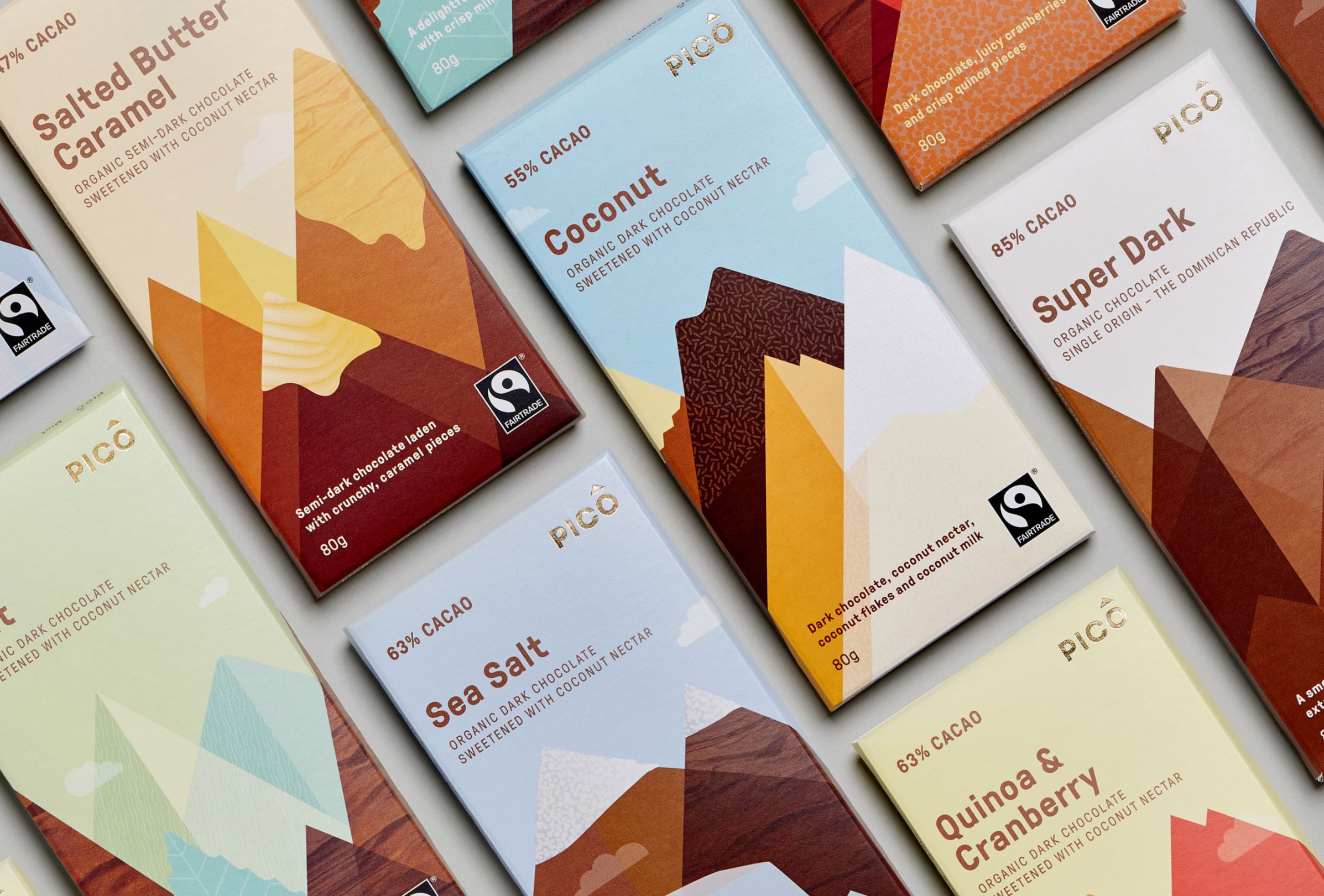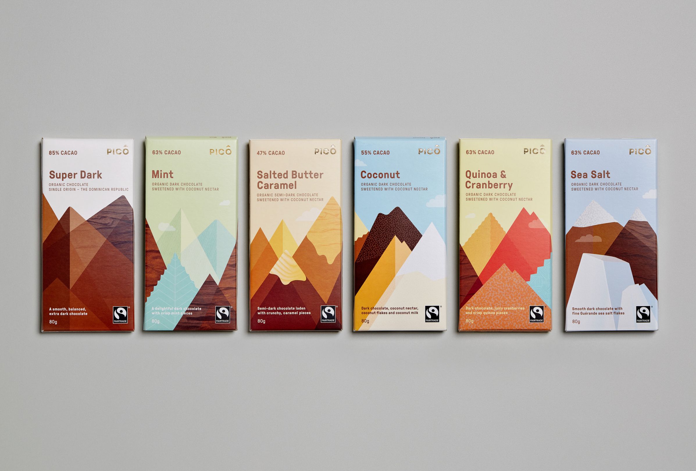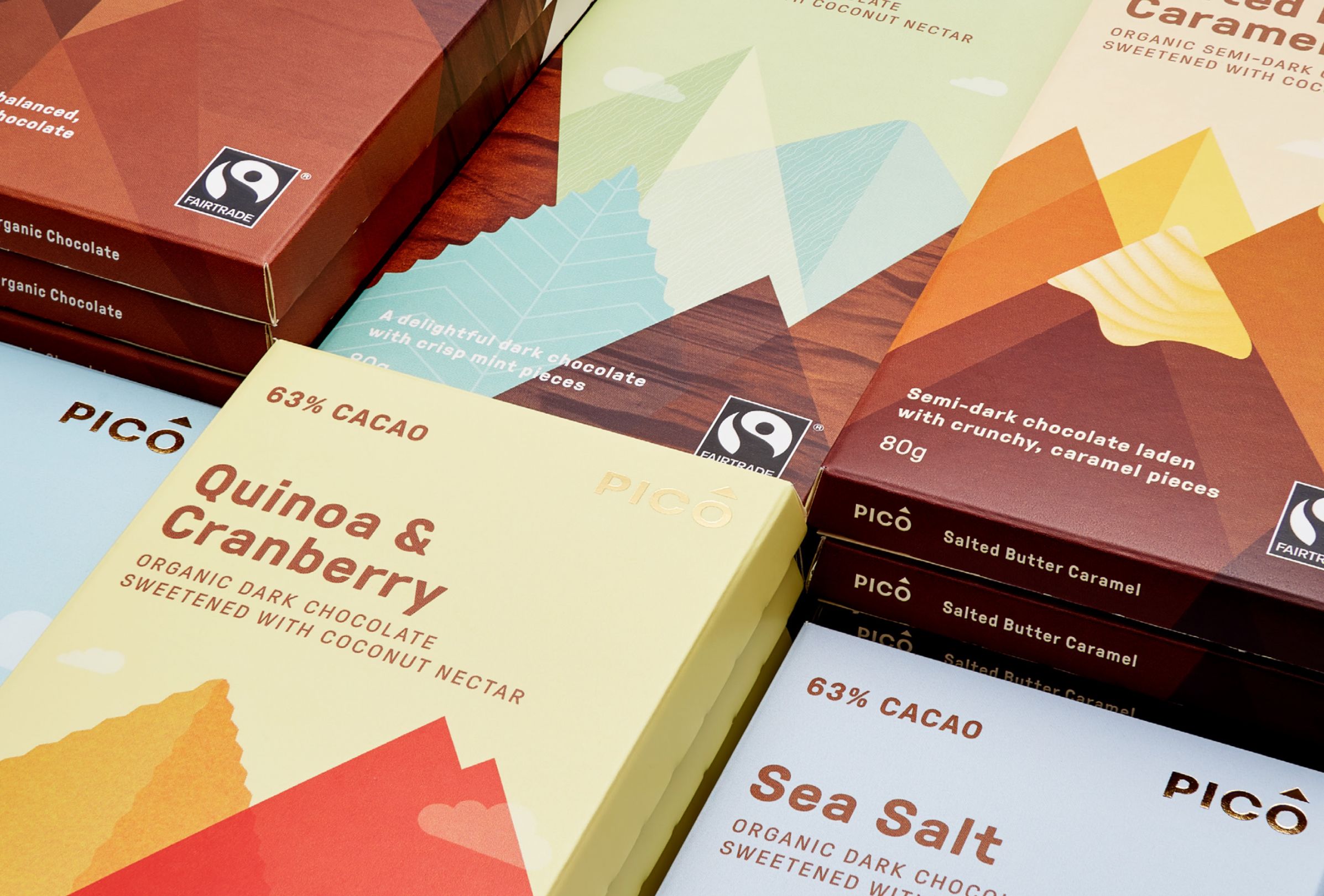


A premium chocolate range launching in an already visually busy environment, Pico required impactful, contemporary branding and packaging whilst giving a nod to its Swiss chocolate-making heritage.
Our solution is inspired by Swiss poster art and its bold geometric forms reinterpreted as flavour and texture cues in the context of an abstract mountain range designed to lend strong shelf impact. The imagery was inspired by the concept of ‘peak’, the literal meaning of pico.
Pico Chocolate has become a successful FMCG brand and is stocked in independent grocery stores throughout Australia.
